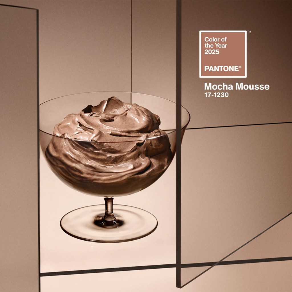
Pantone has announced PANTONE 17-1230 Mocha Mousse as its Colour of the Year for 2025, a rich, warm brown that exudes the comforting essence of cacao, chocolate, and coffee. This selection reflects our collective longing for comfort, indulgence, and a return to simplicity in uncertain times—a sentiment deeply resonant across fashion, beauty, and interior design.
Media outlets like The Times and People Magazine have highlighted how Mocha Mousse embodies the broader cultural shift toward earthy tones and the “quiet luxury” trend—an aesthetic defined by understated elegance, natural materials, and minimalist shapes. Its versatility has made it a darling of designers, seamlessly blending sophistication with approachability.
As we wrap up 2024, I’m excited to share a closer look at some of my favorite campaigns and color pairings that showcase this emerging hue’s potential. As someone who has recently delved into color theory through my newfound passion for painting, I’ll also explore why Mocha Mousse works so brilliantly in these contexts. (And don’t come for me if the shades don’t match perfectly—we’re talking about the beautiful spectrum of browns here!)
The Theory of It All — the Basic Colour Theory
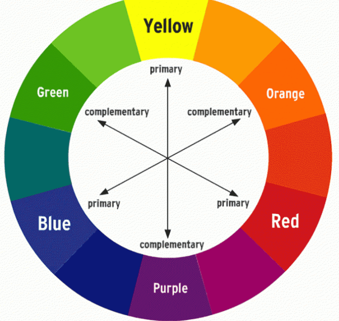
Colours pair well together based on colour theory, primarily because of their position on the colour wheel, with “complementary colours” (opposite on the wheel) creating the strongest visual contrast, while “analogous colours” (next to each other) provide a more harmonious look. In this framework, mocha mousse emerges as a grounding neutral that evokes warmth and security. Its earthy richness pairs seamlessly with other warm-toned shades, creating a cohesive and inviting palette. At the same time, it offers striking contrast when juxtaposed with cooler tones, providing versatility and intrigue.
This duality makes mocha mouse a favorite among designers who want to balance nostalgia and modernity in their work. Its adaptability—from providing a backdrop for vibrant accents to standing alone as a statement hue—speaks to both our need for comfort and our desire for bold, impactful design. This inherent versatility has cemented mocha mousse’s presence not only in interiors but also on the fashion runways and in beauty campaigns. Now let’s take a deep dive into some of the hottest mocha mousse items of 2024 and explore the best colour pairings for this trending colour.
Hottest Campaigns and Mocha Mousse’s (or the broader mocha brown color scheme’s) Rise to Fame
Mocha Brown in Fashion 2024: The Revival of Earthy Luxury
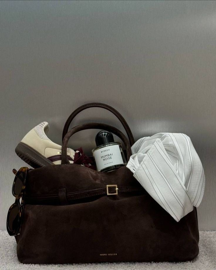
The rise of mocha brown began well before its official title as 2025’s Color of the Year. In 2024, the fashion industry embraced this hue across collections, accessories, and campaigns. Notable brands like DeMellier and Manu Atelier led the charge with their brown suede handbags. DeMellier’s New York Tote in mocha suede became a social media darling, frequently featured in TikTok styling videos and Pinterest boards dedicated to “quiet luxury.” Similarly, Manu Atelier’s Le Cambon 35 tote in chocolate suede saw sell-out success, driven by its appearance in influencer content and flat-lay aesthetics.
Luxury fashion houses such as Jacquemus and Miu Miu also incorporated mocha brown into their collections. Jacquemus’ collaboration with Nike included brown nubuck sneakers that blended performance with high-fashion sensibility, further solidifying the color’s dominance. Miu Miu’s use of earthy tones in runway shows highlighted mocha’s ability to bring depth and grounding to soft, romantic pieces. Across the board, mocha brown has proven itself a versatile player, appealing to both high-fashion consumers and everyday trendsetters.
Indulge in Warmth: Rhode’s Burnt Cinnamon and Marshmallow Fantasy
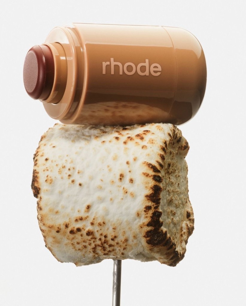
Adding to the earthy-toned momentum, Rhode’s Burnt Cinnamon campaign for their new blush line showcased mocha-adjacent hues in the beauty sector. The campaign’s visuals leaned heavily into warm, rich tones that complemented diverse skin tones while exuding a cozy, autumnal vibe. One of the key reasons for its success was the inclusion of food-inspired imagery. By drawing parallels between the blush’s shade and decadent treats like cinnamon rolls and spiced lattes, the campaign evoked a sensory connection that made the product irresistibly enticing. This clever marketing strategy resonated with audiences, with the campaign’s hashtag amassing millions of views on TikTok and Instagram. It’s a perfect example of how tying beauty products to universally loved experiences, like food, can amplify their appeal.
Best Color Pairings: Elevating Mocha Brown
Mocha brown’s rich warmth makes it a perfect partner for a range of hues, from vibrant contrasts to harmonious complements:
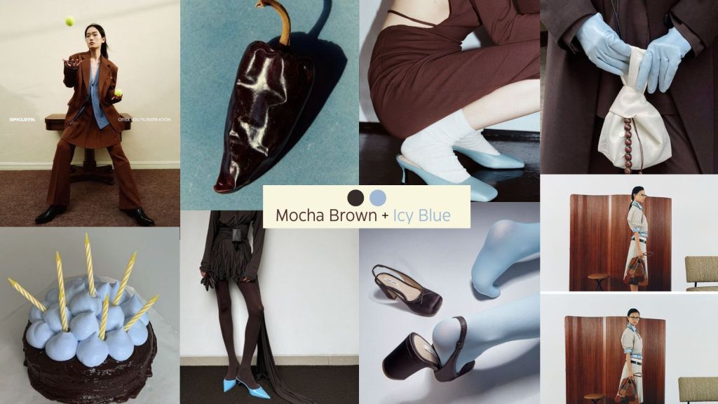
Mocha brown and icy cornflower blue
Mocha brown and icy cornflower blue create a striking yet harmonious pairing that masterfully plays on the principles of color theory. The warmth and depth of mocha brown provide a grounding foundation, while the cool, crisp vibrancy of cornflower blue introduces a refreshing contrast that feels modern and unexpected. This interplay of warmth and coolness evokes a sense of balance, making the combination visually compelling and versatile. Fashion-forward brands like Sandy Liang and Miu Miu have already embraced this juxtaposition, infusing their collections with a sense of playful sophistication. By pairing these hues, they tap into a duality of coziness and chicness, showcasing how earthy, nostalgic tones can be elevated by the clarity of icy pastels. This dynamic contrast also captures the zeitgeist of contemporary fashion—melding comfort with an edge, softness with precision.
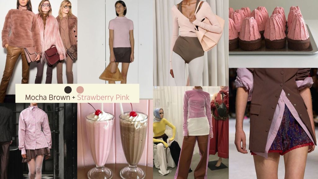
Mocha Brown and Strawberry Pink
Mocha brown and strawberry pink form a delectable pairing that speaks to the heart of color theory—an analogous combination that exudes warmth and harmony. The rich, earthy tones of mocha brown provide a grounding effect, while strawberry pink adds a sweet, playful vibrancy that feels both nostalgic and modern. This combination draws inspiration from universally beloved treats like chocolate-covered strawberries, evoking a sense of indulgence and romance. Brands like Paloma Wool have embraced this duo, crafting collections that merge the soft blush of strawberry pink with the richness of mocha brown, creating looks that feel effortless yet deeply intentional. By juxtaposing these hues, designers achieve a balance that is both cozy and fresh, making this pairing a favorite for those who seek timeless elegance with a whimsical twist. This pairing not only reflects the warmth of familiar comforts but also taps into a broader trend of celebrating natural, food-inspired tones in fashion. Brands like Paloma Wool have mastered this pairing, blending soft pink tones with earthy browns to evoke both nostalgia and modern charm.
Conclusion
2024 laid the foundation for mocha brown’s resurgence, setting the stage for its dominance in 2025 and beyond. This rich, earthy hue has proven to be far more than a fleeting trend; it’s a versatile staple that transcends industries, from fashion to interiors and beauty. Mocha brown’s adaptability allows it to create harmonious palettes with warm tones or bold statements when paired with contrasting hues. Whether featured in the texture of a suede handbag, the softness of a runway look, or the cozy allure of a beauty campaign, mocha brown is a testament to the power of comfort meeting sophistication. It’s a color that doesn’t just follow the trends—it defines them.

Leave a comment